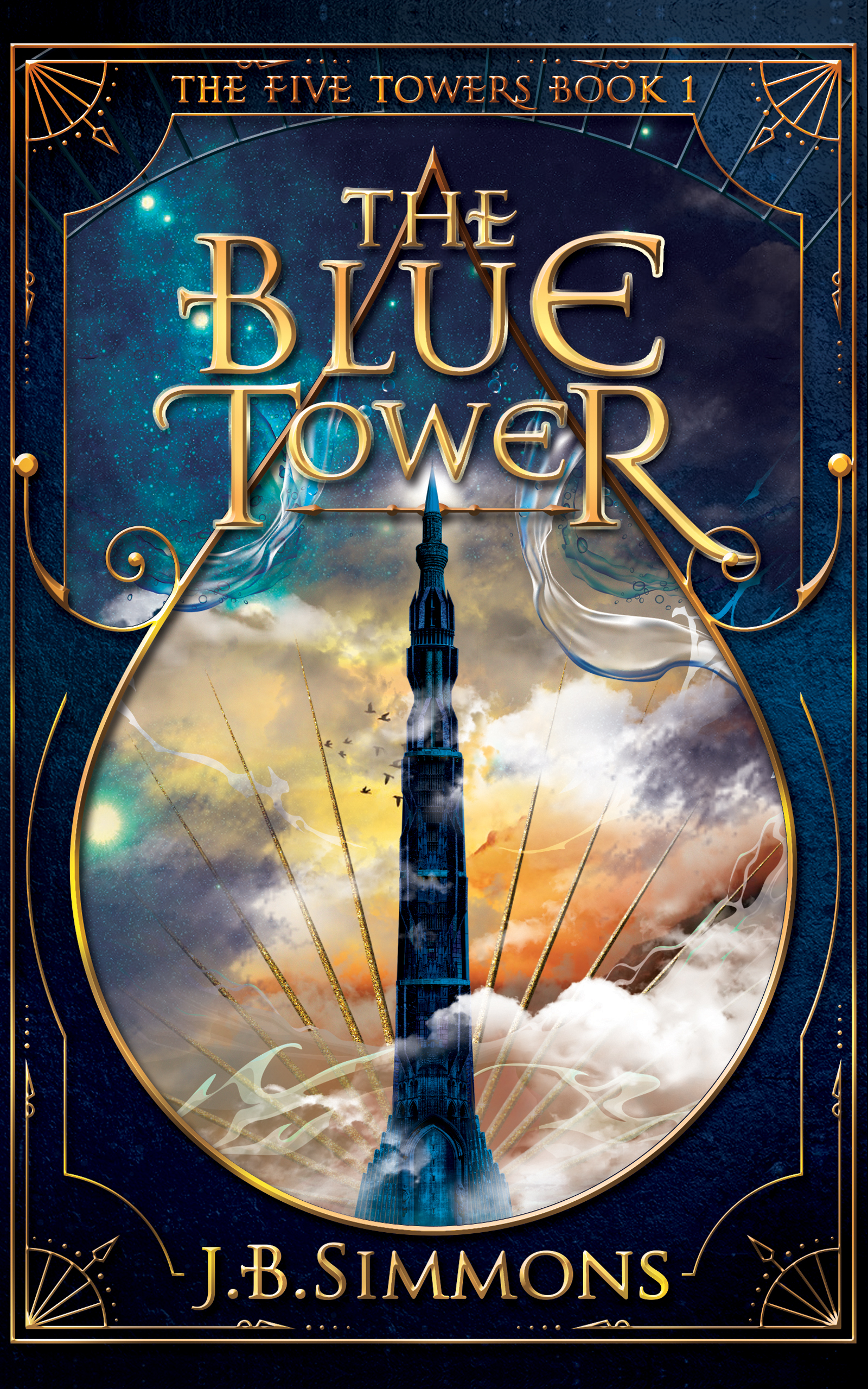
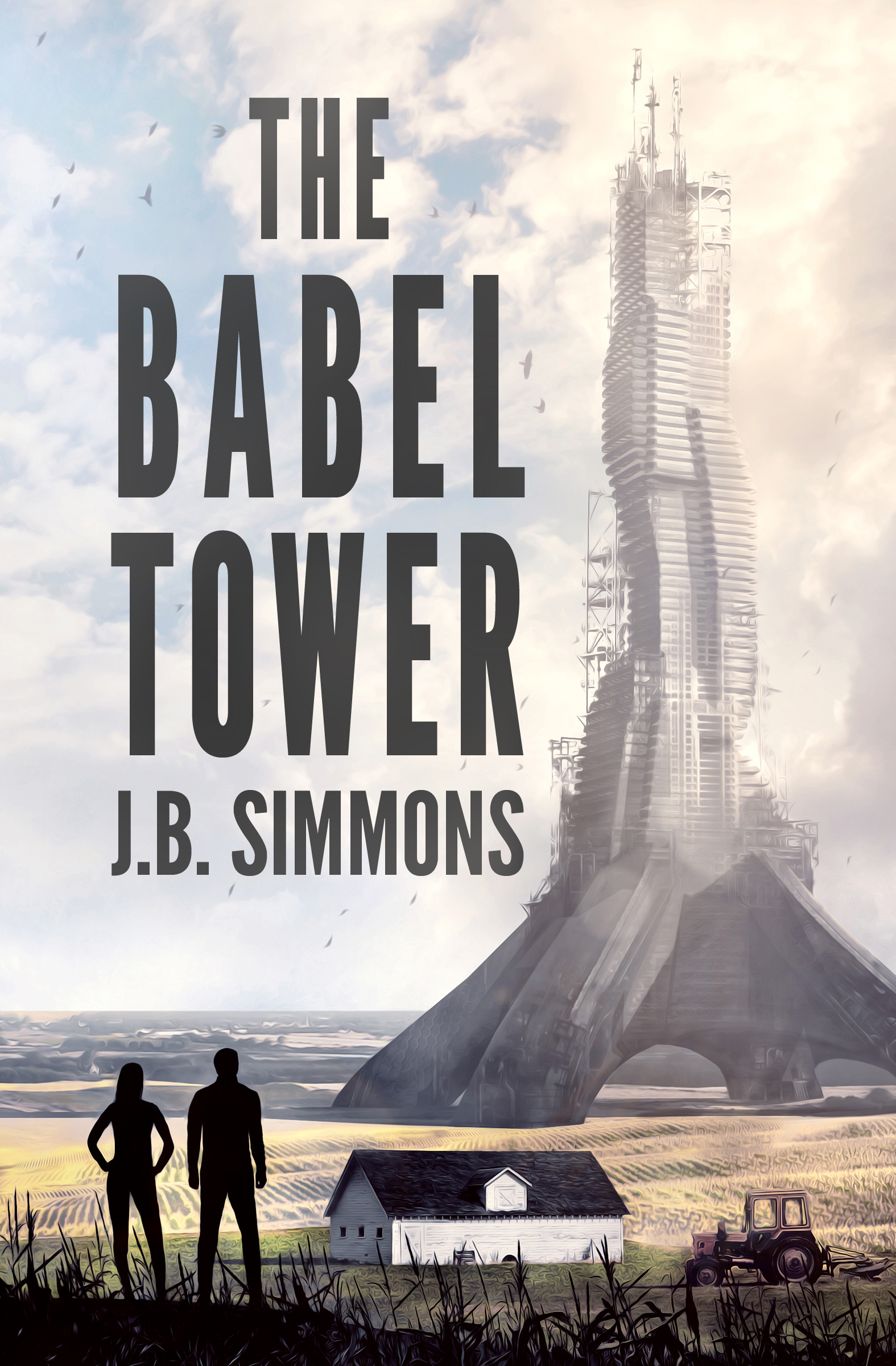
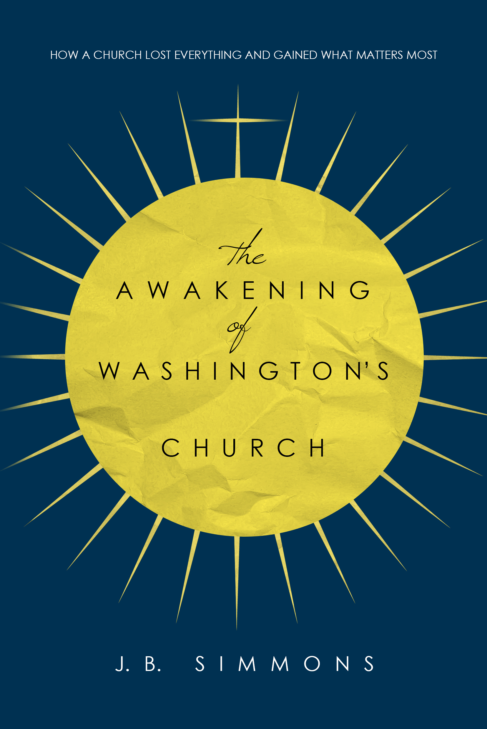
Interview with Book Cover Designer Kerry Ellis
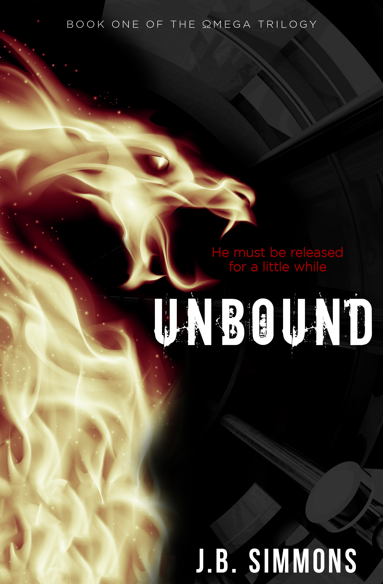
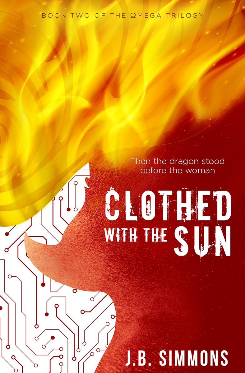
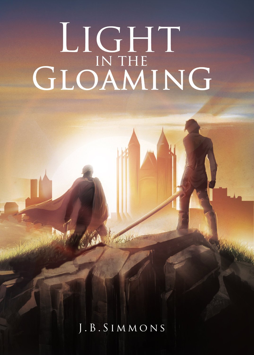
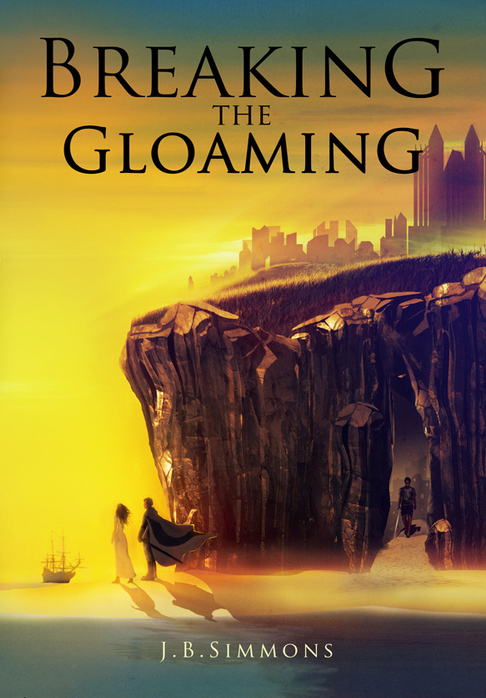
/Kerry Ellis designed the cover of UNBOUND. As with all covers, the image speaks for itself. But how often do the designers get to tell us about their craft? Not enough, in my view. It's my pleasure to interview Kerry in this post.
To learn about how I connected with a designer of Kerry's caliber, read my inside story on the 99designs process here.
1. Let's start with a question of great interest to readers, writers, and designers alike: what are the secrets of a great book cover?
Kerry: No one’s ever told me the secrets, but I think the best book covers are the ones that are eye-catching without giving away the whole story. There has to be enough intrigue left to entice the reader to pick the book up and explore it further, but also enough information that they have an idea of what they’re getting into. Ideally, a cover sparks an emotional reaction in a potential reader, one strong enough to also engage their curiosity.
This is accomplished through many things people may not consciously realize: font type, color choice, layouts that follow or break the grid, the art itself, and more. For example, script fonts and pastel colors are more likely communicate a novel is a romance. And all-caps serif fonts with cool colors hint more at mystery or action.
So every book cover is about finding the right combination of those core elements that tell people just enough about the story the book contains without giving up the plot.
2. Tell us a little bit about yourself. How did you get into art and design?
I was always a doodler, and I grew up taking art classes, voice lessons, dance, and theatre classes. So I was surrounded by art growing up (I think my mother just wanted to keep me busy!), and I loved learning about it through art history courses and museum tours.
Unfortunately, I suck at shading, so my drawing skills never took off (though I’m great at flat design). Thankfully, computers became all the rage when I was about 17. I picked up photography in my twenties. And together those led to a fascination with digital art and compositing.
Around this time, I also landed my first big promotion in my career as an editor, and the designers at that company were very tolerant of my wanting to learn layout in InDesign and how to use Illustrator and Photoshop better. I began creating books and posters and other print materials in that job and ever since. I’m very thankful to those who taught me the tools that allowed me to explore this passion.
3. We connected through 99designs. How much of your cover design work comes from 99designs? What are your thoughts about that platform in particular?
About 75% of my cover work is done through 99designs, and I am not a full-time freelance designer.
The platform is good for those who are just starting out as freelancers and don’t have an existing client base, as it allows them to practice tons and learn how to improve whenever a design isn’t chosen. It’s a very tough platform because designers end up doing a lot of work without pay, which is the biggest critique designers have for it. And a very valid one.
For me, personally, it ended up being a lifesaver last year when I was unexpectedly laid off. As I did not have a strong existing client base for my freelance work (since I was working full time in my career), I couldn’t drum up much business from my contacts—and I’m horrible on the business side of things in the first place. Throwing myself into design full-time through 99designs allowed me to keep up with my mortgage payments and other bills. And I built a small pool of clients that gave me some much-needed recurring work during the 6 months I was unemployed.
Now that I’ve found a new job, I still enjoy using 99designs as a creative outlet when I reach a block in my own work. I love being able to select the projects I want to work on and hone my skills with.
4. What is your general process for generating ideas and putting together covers?
The first thing I do is read! Read the brief, read any sample chapters, read the author’s bio if they’ve provided a website or I can drum it up through Google. Sometimes this conjures up strong visuals in my head, so I’ll go out to find or create images that fit those visuals. I either sketch, scan, and digitally create a flat design, or I’ll photograph something if I have it on hand and it fits, or, most commonly, I’ll go searching through stock sites to find pieces and parts that I can blend together into a new piece of art.
If I don’t have a full idea, I’ll search stock sites for a kicking-off image—a photo that captures an emotion or my imagination in some way. It will become the base around which I build everything else.
But I always start with the art. If I can’t get to a place where I’m happy with the art, I’ll scrap the idea and start again. Only when I’m happy with the concept art will I proceed to selecting fonts and layout to fully realize the cover. Font selection can take a really long time for me and, in some cases, has led to me creating a font when I couldn’t find an existing one to suit.
5. How much fine-tuning and editing is typical between your original ideas and the final product? What is that finalization process like?
There’s an average of about three revisions every time if the author likes my initial concept enough. It usually comes down to tweaking colors, font placement, and sometimes font types. When the concept is strong, very rarely do I need to tweak the main art. Though until a cover is selected as “the one,” I work with low-res and watermarked art as a preventive measure, so I’ll always do a quick rework with high-res images in the finalization stage.
6. If you could give one tip to authors and publishers about working with cover designers, what would it be?
Keep an open mind! If you have a very specific picture in mind that you want created, you want to hire an illustrator, and THEN a cover designer. Some illustrators can do layout, and some cover designers can illustrate, but it’s rare to find both skills in one creative individual. So try to avoid being too specific at the beginning of the process. Designers are great at presenting visuals you may have never thought of.
May I cheat and add a second? Specs! For effective layout, know the exact dimensions of your cover, from trim size to spine width to bleed margins. There’s nothing worse than getting the balance of a design just perfect and learning the art needs to be an inch wider due to a page count or trim size change that altered the spine width and bleeds.
7. What is your favorite all-time book cover?
I’m going to have to cheat again and choose a series: Penguin Drop Caps. They are by talented illustrator and typographer Jessica Hische.
I’m generally a huge fan of most Penguin Book covers that capitalize on the modern, flat-design aesthetic. I adore minimalistic design and hand-lettering, and with Penguin Drop Caps, they combined both my personal loves into a fantastic series.
8. If others are interested in your amazing design services, what's the best way for them to contact you?
I can always be contacted through my site, here.
9. You beat a crowded field of talented designers for the Unbound cover, including in a poll with over 70 votes. What was the secret to your success?
Luck! I think I was lucky that my aesthetic resonated with you. Design is so subjective, no amount of skill can guarantee something will resonate with the intended audience. So I always feel lucky when it does.
Thanks, Kerry! Let's make our book covers count -- J.B.
PS. I think Kerry has more than luck going for her. If you like the cover of UNBOUND, you'll love the sequel's cover. To see it, click here.


